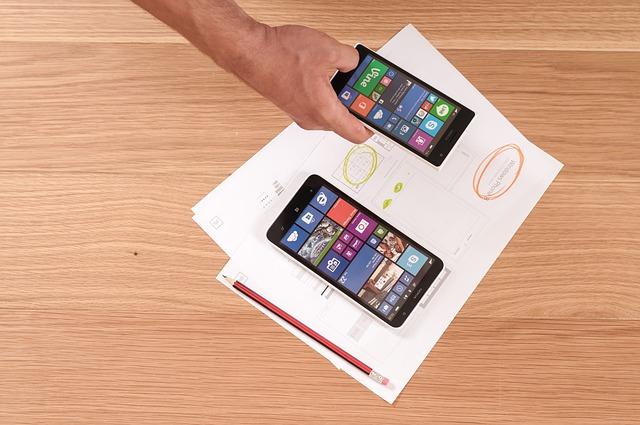

Micro-interactions are the subtle, functional moments within a digital product that turn an ordinary user experience into something memorable, intuitive, and engaging. Whether it is the satisfying pull-to-refresh animation on a mobile feed, the slight color shift of a button when hovered over, or the lively bounce of an item landing in an e-commerce cart, these miniature design events bridge the gap between human intention and digital response. By focusing on these tiny touchpoints, designers can provide clear, effortless user feedback that communicates system status, guides actions, and adds personality to an interface without cluttering the screen.
Why Micro-Interactions Are Essential for Modern UX Design
In contemporary UX design, user attention is fleeting, and tolerance for confusion or friction is virtually zero. Micro-interactions play a crucial role in eliminating ambiguity by delivering immediate visual, auditory, or haptic confirmation. When a user clicks a button, they shouldn’t have to wonder whether the action was registered. A well-designed micro-interaction answers that question in milliseconds.
Beyond pure functionality, these small details humanize digital products. They transform rigid software into a responsive environment that reacts dynamically to input. When implemented thoughtfully, micro-interactions reward user behavior, encourage exploration, and cultivate positive emotional connections, turning functional utility into genuine user delight.
The Four Core Components of an Effective Micro-Interaction
To master micro-interactions, it helps to understand their anatomy. According to interaction design principles, every micro-interaction consists of four key stages:
1. The Trigger: The mechanism that initiates the interaction. This can be user-initiated (clicking a toggle, swiping a card, tapping an icon) or system-initiated (an incoming notification, a location-based prompt, an error alert).
2. The Rules: The underlying logic that dictates what happens once the trigger is activated. For instance, clicking a “Download” button starts a file transfer and prevents additional clicks.
3. The User Feedback: The visible, audible, or tactile signal that informs the user what is happening based on the rules. This might be a loading spinner, a checkmark animation, or a subtle vibration.
4. Loops and Modes: The parameters determining the duration and repetition of the interaction. A loop might dictate how long a progress bar pulses, while a mode changes the interaction behavior under specific conditions (such as entering “Edit” mode).
Effortless Ways to Deliver Seamless User Feedback
Integrating impactful feedback into an interface does not require complex, resource-heavy animations. In fact, the most effective feedback is usually lightweight and frictionless. Here are practical ways to elevate feedback mechanisms across your designs:
1. Interactive Button States and Progress Indicators
Static buttons leave users guessing, often leading to repeated clicks and server strain. Replacing static buttons with animated state changes—such as transitioning from “Submit” to a compact spinner and finally to a green checkmark—provides clear progress tracking while reassuring the user that their request is being processed.
2. Real-Time Form Validation
Filling out online forms is often a source of friction. Instead of waiting until the user submits the entire page to highlight errors, provide inline micro-feedback as they type. A subtle green outline for a strong password or a gentle shake animation for an invalid email format corrects mistakes immediately, reducing frustration and abandonment rates.
3. Swipe, Drag, and Gesture Confirmation
As touch-based interfaces dominate modern design, gestural feedback has become indispensable. When users swipe to archive an email, adding a smooth color transition or exposing a distinct icon beneath the card confirms the action before it completes. This tactile response prevents accidental actions and makes navigation feel physical and grounded.
4. Meaningful Micro-Animations for State Changes
Toggles, switches, and accordions should never snap instantly from one state to another. A rapid, fluid motion—such as a toggle knob gliding across a track or an accordion smoothly expanding downward—helps the human eye track changes in context, eliminating visual jarring.
Best Practices for Implementing Micro-Interactions in UX Design
While micro-interactions can significantly enhance an application, overusing them can lead to a chaotic and overwhelming interface. Adhering to established design principles ensures that micro-interactions remain an asset rather than a distraction:
Prioritize Speed and Subtlety: Micro-animations should be swift, typically lasting between 200 and 400 milliseconds. Anything slower feels sluggish and impedes productivity, while anything faster can be missed entirely.
Maintain Visual Consistency: Ensure that timing curves, color transitions, and motion styles match your overall brand identity and design system. Consistent feedback patterns make the interface predictable and easier to learn.
Design for Accessibility: Always consider users with motion sensitivities. Ensure your interface respects `prefers-reduced-motion` settings in CSS, providing static, non-animated alternatives for feedback where appropriate.
Keep the Focus on Utility First: A micro-interaction should always serve a clear purpose before aiming to delight. If an animation looks impressive but slows down the user’s workflow or obscures essential information, it should be simplified or removed.
Elevating the Overall Digital Experience
Great digital experiences are rarely defined by single, massive features; rather, they are built on a foundation of hundreds of well-executed details. By utilizing micro-interactions to provide immediate, clear, and elegant user feedback, designers can create intuitive pathways through complex digital landscapes. When you pay attention to the smallest details of UX design, users notice—not because the interactions demand attention, but because using the product feels effortless, dependable, and enjoyable.